Color Palettes That Promote Rest and Recovery Overnight
Choosing the right color palette can influence how quickly you fall asleep and how well you recover overnight. Subtle shifts in hue, saturation, and contrast help set a calming ambience that works alongside lighting, ventilation, and acoustics. This article outlines practical color approaches, materials, and room strategies to support rest without dramatic redesigns.

How does color affect sleep and ambience?
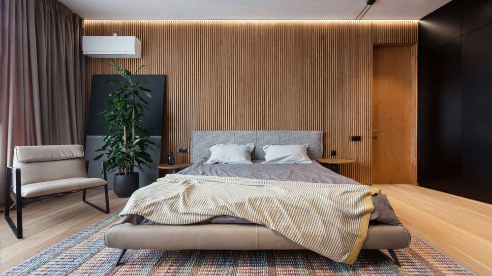
Color directly influences mood and perceived temperature, which in turn affect sleep readiness. Cooler, muted hues such as soft blues, gentle greens, and warm greys tend to reduce visual stimulation and can feel soothing at night. Saturation matters: highly saturated or very bright tones increase alertness, while desaturated shades help lower arousal. Pair color choices with textures and materials—matte paints, natural wood tones, and low-reflectance surfaces keep the room visually quiet and support a restful ambience.
What lighting and layout choices support recovery?
Color works with lighting and layout to shape sleep-friendly environments. Use layered lighting: dimmable overhead fixtures, bedside lamps with warm color temperature, and blackout-ready window treatments to control natural light. Arrange furniture to create clear pathways and a restful focal point for the bed; a calm layout reduces stress and aids relaxation. Consider task lighting that won’t cast glare on walls or surfaces whose color reflectance could disrupt perceived warmth or coolness at night.
How can textiles and materials improve comfort?
Textiles and materials influence both color perception and tactile comfort. Soft, natural fabrics like cotton, linen, or wool in neutral or muted tones help absorb light rather than reflect it, maintaining a gentle palette. Layer bedding with complementary colors—a muted sheet set, a slightly darker duvet, and a neutral throw—to create depth without contrast that overstimulates. Rugs, curtains, and upholstery in coordinating shades also contribute to insulation and a cohesive visual field that supports relaxation.
How to address acoustics and insulation for better rest?
Colors alone won’t fix noise, but coordinated materials can. Use soft, muted color finishes alongside sound-absorbing textiles and insulation to reduce echoes and outside noise. Heavier curtains in darker or matching hues, upholstered headboards, and area rugs both improve acoustics and maintain a calming color story. Proper insulation and window treatments that blend with the palette help secure consistent temperature and reduce disruptions to sleep cycles.
How does storage and organization influence sleep quality?
A restrained color scheme paired with smart storage keeps the bedroom visually uncluttered and reduces cognitive load at bedtime. Built-in or concealed storage in colours that coordinate with walls and furniture lets items disappear from view. Declutter surfaces and use consistent tones for baskets, shelving, and closet doors to maintain a calm visual plane. Good organization reduces bedtime stress and makes the room feel restful, supporting quicker sleep onset and better overnight recovery.
What sustainable choices support long-term bedroom wellbeing?
Sustainability intersects with color and material choices: low-VOC paints in soft tones, sustainably sourced textiles, and natural materials reduce indoor pollutants and maintain air quality. Choose breathable fabrics and finishes that align with ventilation strategies to avoid poor indoor air that can disrupt sleep. Reusing or refinishing furniture in a muted palette extends its life, while selecting materials with good insulation properties can improve thermal comfort and reduce energy needs.
This article is for informational purposes only and should not be considered medical advice. Please consult a qualified healthcare professional for personalized guidance and treatment.
Conclusion A restful bedroom palette balances hue, saturation, and texture to create a visually calm environment that supports sleep hygiene. When color choices align with considered lighting, sensible layout, effective storage, and appropriate materials, the room promotes recovery without dramatic renovation. Thoughtful, modest adjustments—coordinated textiles, matte finishes, and soft layered lighting—can yield meaningful improvements in overnight rest and long-term comfort.


